BLOGGER TEMPLATES - TWITTER BACKGROUNDS »

Wednesday 9 December 2009

Welcome to the online blog for the new slasher horror film, Hanging On The Heath. The following pages document the process of creating a marketing campaign for the film, from concept to final products; a teaser trailer, film poster and magazine front cover. It also includes an evaluation of the project, highlighting the codes and conventions, technologies used and what was learnt from audience feedack...

Tuesday 1 December 2009

01.12.09 - Evaluation

Using/Developing/Challenging Conventions

Trailer
To begin the project, I researched both theatrical and teaser trailers in order to gain a good understanding of the conventions to create an effective and accurate media product. Following this analysis, it became clear what these conventions were and the difference between the two types of trailer.

One of the main conventions that came up in the analysis of all the trailers was the footage had been shot especially for the trailer. This is so the film can be promoted while it is still in production or to create a back story. We have done exactly this by using especially shot footage that provides a back-story explaining the killer’s death. We have not focused of showing the narrative, which is another convention of a teaser trailer we have adhered to. A teaser simply acts as a way of getting the title ‘out there’ and the storyline can be indicated in a theatrical trailer at a later date. Our trailer also holds back a lot of information to create a sense of mystery which is another convention of a teaser trailer.

To ensure our trailer was a teaser, we followed these conventions as closely as possible to ensure that our product is accurate and will fully serve its purpose. Research was also conducted into the slasher-horror genre, including an analysis of killers, plot lines as well as titles. The conventions of these were highlighted to again ensure that we create an effective media product. All six killers that I analysed happened to be male, all with some form of deformity or wearing a mask. This is something we wanted to challenge, and did so by creating an unmasked female killer. Our intention was to create a sense of realism, and did so by using a killer that was visually closer to human. The use of a mask or deformity is generally to highlight the killer’s separation from humanity and the other characters involved however, we have highlighted this separation through the use of costume; a blooded old fashioned nightdress and bare feet. Many killers showed a menacing facial expression depicting a pleasure in killing; we have shown this in the final frames following the film’s title. This also indicates her change of personality following her death or capture as well as leaving a strong image in the viewer’s minds.

In the research stage, it also became clear that killers in this genre were normally killing to gain some sort of revenge for an incident that has happened to them prior to their death. In our trailer, this is told through the use of a voice over, explaining that she suffered years of prejudice because she was believed to be a witch and eventually went into hiding where she was caught and hung. The reasons for this accusal is not clear however it did not need to be as it was important to retain information to create a sense of mystery.

As identified in the plot lines that were analysed, we included a mixture of amoral and more intelligent teenagers in our synopsis. A group of teenagers can be seen in the trailer however their character traits are not displayed. Although one of the conventions of a teaser trailer is to introduce character, we have focused the trailer purely on a back story of the killer and the characters personalities can be shown in a theatrical trailer at a later date.


Film Poster
To accompany the teaser trailer, a film poster was also designed and created. I looked at existing film posters to influence my decisions on the design and content. It was clear that film posters of this genre used conventional colours such as black, white and red which can also be seen in my research into slasher horror titles and the use of this in our own title can be seen here: http://hangingontheheath.blogspot.com/2009/11/051109-film-title-designed.html We decided to follow a more simplistic design, using minimal colour and imagery to follow that same sense of mystery seen in the trailer, using this poster as our main inspiration: http://www.midwesthorror.com/sitebuildercontent/sitebuilderpictures/hatchet-horror-movie-poster.jpg where the use of one piece of imagery creates other questions about what else could be in the film. Although the teenage characters cannot be seen in this poster, which may not make the target audience clear, we have indicated the BBFC’s 15 certification on the poster showing this film is suitable for that audience: http://www.bbfc.co.uk/ As mentioned previously, these characters can be shown in other pieces of the marketing campaign such as a theatrical trailer at a later date.

Magazine
Similarly, I looked at existing magazine covers to gain a clearer idea on the design and content. We wanted to make sure our magazine had the same quality as the biggest sellers such as Empire and Total Film so looked to these for inspiration. We decided to title our magazine Britscreen to target a British audience, using a simplistic master head to prevent the eye from being distracted by it. As seen in this issue of Total Film http://mos.totalfilm.com/images/m/magazine-420-75.jpg we overlaid part of the subject on top of the master head to gain maximum attention. Conventionally, a film magazine would use a close up or mid-shot as their cover image however we have decided to use a long shot to show the killers entire costume as well as setting as this could not be shown in her face alone. This also leaves more space around the subject to include subheadings indicating other articles in the magazine. We have chosen these articles to relate to other horror movies to promote this genre and fit with our cover story turning the magazine into a ‘slasher-horror special’.

-
Effectiveness of main product and ancillary texts as a marketing campaign

By comparing our marketing campaign with existing campaigns, I think it is clear that we have created an effective set of promotional tools that can be accessed by a global audience, ultimately drawing in a potential audience of older teenagers, as well as creative and aspiring adults.

Our teaser trailer will spread a viral marketing campaign; the limited amount of information given in the trailer creates enigma and mystery, drawing the audience in, causing them to seek more information online and through other sources (the website address is listed in the final frames of the trailer) - this is an example of synergy, the promotion of a product through other media platforms. The hype created by this will spread further through word of mouth and continue to spread so that when the theatrical trailer, poster and magazine articles are released, there is already an established audience. Another example of this can be seen in the release of Batman Begins (Christopher Nolan, 2005) as there was already an established audience it was easy to create a viral marketing campaign through the use of a simple bat symbol with little text information. The use of the internet is particularly effective as our target audience will be 'computer savvy' and the use of this can be seen in the marketing campaign for Cloverfield (Matt Reeves, 2008) where social networking sites Facebook and Myspace were used to kick off a viral marketing campaign within the same target audience.

This method is needed for titles that do not already have an established audience. Again, films such as Batman (Tim Burton, 1989) will only have to release the iconic symbol as a poster to create hype, because its audience already exists. http://narrativebranding.files.wordpress.com/2009/10/batman.jpg

-
Media Technologies

Throughout the project, both in research and planning as well as the construction and evaluation stages, a wide range of media technologies were used and converged into three media products.

We began by using both film and still cameras, to film footage for the trailer and still images for the other products. This was then transferred to the Apple computers using a FireWire and imported into iMovie where the clips were cut down, placed in order and combined with a copyright free soundtrack as well as a voiceover which was extracted from existing video footage. Following research, the soundtrack was taken from a copyright free source at http://www.freeplaymusic.com/

Production titles were created from scratch using Adobe Photoshop and imported into iMovie where it was placed in the appropriate sections of the time line. These titles are explained in more detail here: http://hangingontheheath.blogspot.com/2009/11/201109-teaser-trailer-final-edit.html

Once the editing was complete, the footage was exported as a Quicktime movie, both full quality and web streaming for use in the online blog. The still images were also manipulated in Photoshop, where they were resized, enhanced and corrected where needed for use in the poster and magazine. These products were also assembled using this software and were finally exported as a JPEG file so it can be viewed online.

All three final products were uploaded onto an online blog using http://www.blogger.com/ where evaluations both in text containing hyperlinks, and video can be seen. As this is a modern, more efficient way of accessing media, popular with a technological savvy audience, it can be a valuable asset to the marketing campaign as it can be accessed by the target audience globally. Similarly, the marketing campaign for Cloverfield (Matt Reeves, 2008) used the internet to create a viral marketing campaign through the use of the social networking site Facebook. This meant information prior to the films release could be accessed by the target audience through a website used frequently by them.

Any videos uploaded onto the blog were also uploaded onto http://www.youtube.com/ as an alternative if any technical faults and various images such as film stills, storyboard pages and flat plans were uploaded onto http://www.flikr.com/ to shorten the blog, creating a more dynamic way of viewing lengthy information, making it easier to take in. Part of the audience feedback was gained by collecting comments on Youtube as well was http://www.facebook.com/ as stated previously, using the internet as part of a marketing campaign is an effective way of accessing a particular target audience, in this case, an audience of teenagers and young adults who will be frequent users of the internet.

Saturday 28 November 2009

28.11.09 - Teaser Trailer - Final Edit

-
Taking our audience feedback into consideration, we made a few final changes: Following the advice of a media teacher in another school, we made two minor changes to see if our trailer could improve. These consisted of correcting a spelling mistake at the begnining and removing part of the video footage that containts the dialouge "because she'll kill you". Before this is said, a student asks 'Why can't we see her grave?' however, the question is answered therefore suspense and mystery is removed. By removing his response, we are left wondering why it is not possible to actually visit her grave, making us want to see the film on release to answer these questions. I feel that the trailer is now far more effevtive in teasing the audience and is suitable for use with our other media products creating a marketing campaign.

Sunday 22 November 2009

25.11.09 - Audience Feedback

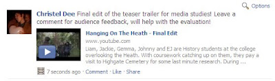
To help assess the effectiveness of our teaser trailer, I gathered some audience feedback to look for any improvements and aid my evaluation. I began by posting the trailer on YouTube, a website extremely popular with the target audience. I then posted the link on Facebook, another website the target audience is involved with. The comments can be seen below:


Although I thought this method would be effective, I only managed to gain a limited amount of comments meaning I was not able to gather enough evidence from it. I knew that the only way to successfully gather this feedback would be to speak to them in person.

Instead, I transfered the trailer onto a portable device, nameley an iPod, and in person, showed the trailer to a small selection of the target audience. I then video recorded their responses to two questions: 'What did you think of the trailer?' and 'Would you want to see this film?' These comments can be seen below:


Alternate Link: http://www.youtube.com/watch?v=ccAJD7sItZA

Comments that frequently came up:

  • Well made/edited
  • Interesting
  • Professional
  • USP was highlighted - Hampstead Heath
  • Does not give alot away, 'un-answered questions'

From this peice of audience feedback, it is clear to me that we have successfully created a trailer that attracts our target audience. Many said it was interesting which is evidence that it could be appealing to ‘creative and aspiring’ adults. It was said it was well made and well edited giving us evidence that we have effectively used the video editing software as well as looking professional, suggesting we have effectively used the conventions of a teaser traler. We can see that the Unique Selling Point has been highlighted as audience members liked the use of the Heath; an existing place they can relate to. Finally, many said they were most persuaded to see the film from the un-answered questions and how little the trailer gives away. This is a convention that we have adhered to.

Despite this positive audience feedback, there is one problem - its all positive. To improve the trailer, I will need to get the views of members of anonymous members of the public however I do not think this is necessary as I am confident our trailer fully serves its purpose as a marketing campaign.

Friday 20 November 2009

20.11.09 - Teaser Trailer - Second Edit - New Production Details


-

After reveiwing the first edit of the teaser trailer, we created a second edit with small adjustments to make it more effective in selling the film. These changes included a new non-copyrighted soundtrack from http://freeplaymusic.com/ as well felt the previous soundtrack did not create enough atmosphere or suspense. We chose a quieter soundtrack that used low strings rather than a higher pitched melody as in the first edit, this medlody was too distracting from the voiceover and visuals on screen. The second change included removing some of the running shots, turning it into one continuous scene rather than a series of shots from different angles. In the first edit we thought this rapid change of shots would create suspense and a feeling of disorientation however in order to create a better sense on continuity and fit within the new sound track, we needed to shorten the running scene.

The film works logo was also altered - being the first frame in the trailer, it is important that the genre is immediately highlighted, therefore we changed some of the lettering to the conventional colour red, depicting horror. The font was also widened to reinforce a cinematic atmosphere. In the frames following this, the voiceover can be heard however the screen is blank while this is said. Although this brings more focus onto what is being said, we thought we could fit another line of text that will help to sell the trailer. This read 'From the makers of the Excorsist'. Although our company are not the makers of this film, we were able to use it as this trailer is fictional. If this was a real film however, this would be effective is selling it as discovered from previous research, it is conventional for a trailer to highlight the director, producer or makers of the film. By using this, audiences can liken this film to others they have seen, producing audience expectations, giving them a good idea of what to expect. Also, although some audiences may not necessarily like the concept of the film, they may want to see the film purely because they like films by those particular directors or producers. This is the same for actors.

Finally, the last frame was altered slightly to resemble that of a real trailer more closely. From my analysis of teaser trailers, I noticed that it was conventional not to include a specific date but only the year the film is being released in as often the teaser trailer is released while the film is still in production. Here, we have used this by simply stating 'coming 2010'. To create consistency, we added the red lines used in the film title which will reinforce the horror genre to the final frames and leave this image in the veiwers minds when they leave the cinema. We have also incuded a link to the website as the young, modern audience will want to access information this way.

To gain an idea about the layout of this information, we studied some other teaser trailers, paying attention to the final frames and found many of them followed this format. The trailer for Clash of The Titans (Louis Leterrier, 2010) is what influenced our design the most.

To find out if our trailer serves its purpose in making the target audience want to see the movie, I will show it to the relevant target audience and ask their opinion as well as a post-production questionnaire.

Tuesday 17 November 2009

17.11.09 - Magazine Cover - Planning and Production

As part of the marketing campaign, we were also required to create a front cover of a film magazine featuring our film. Like the poster, we began by choosing an image we thought would be most effective. In this case, we selected a long shot of the killer as it would be easier for the text displaying other sections of the magazine to be visible. Conventionally, a mid shot is often used on the front cover of a magazine however, as this is a film magazine it would be easy to break this convention. This is because a long shot taken outside of a studio looks more like a film still rather than a posed shot taken in a photoshoot specifically for that magazine. It is also a shot that is commonly used in film, therefore it would create a cinematic atmosphere reflecting the theme of the magazine and would make it acceptable to use this as a cover image: http://www.flickr.com/photos/shockstudios/4111900065/in/photostream/

After our image was selected, a flat plan was created to indicate where text would be placed and what other content would be featured in the magazine: http://www.flickr.com/photos/shockstudios/4155286564/in/photostream/ We decided to call our magazine Britscreen, a magazine issued specifically for British films. We also decided that this magazine would be a slasher horror special to go with our cover image and make it more acceptable to use conventional horror colours for the rest of the magazine.
-

Using Adobe Photoshop, the colours of the image were adjusted to create a darker tone suggesting the horror genre. We chose a simplistic font for the magazines title to suggest this magazine caters for all types of film and audiences however, included whites, blacks and reds in our text to fit the slasher horror theme of this special. I sophisticated the cover more by overlaying the subjects head in front of the text to showcase the magazines content more than the title and added shadows on the text making it easier to read. To finish, a barcode was added as well as the date (september 2009) ahead of the release of the movie to boost a viral marketing campaign prior to the films release. We decided the magazine would be priced at £3.50, a price close to that of other film magazines with a similar target audience.

Monday 16 November 2009

16.11.09 - Film Poster - Planning and Production

As part of the marketing campagin, we were required to design and produce a film poster publiscising the film. To begin this process, we looked through the images that were taken and selected the image we thought would be most effective. We chose an image of the killer where she looked the most sinister to reflect her evilness and indicate to the audience her role in the film: http://www.flickr.com/photos/shockstudios/4111908409/in/set-72157622920620336/

Using our chosen image, the poster as flat planned to indicate what text will be applied and where: http://www.flickr.com/photos/shockstudios/4154525853/ Following this, I manipulated the image using Photoshop. The process involved removing the background and replacing it with black and blending the image into it, removing the eyes and adjusting the tone to reflect a more sinister atmosphere and adding a slight blur on the image making it more ghost-like. I then added the title of the film which was also blurred and the other text such as production details, certificate issued by the BBFC, release date and tag line. The outcome of this can be seen below:


This poster uses generic conventions seen in horror such as the use of black and white depicting the conflict between good and evil as well as death and red to suggest bloodshed. It also uses imagery that can be considered frightning, indicating the genre of the film and the themes within it. We chose a release date close to halloween as it is a popular month for people to watch horror films. By doing so, we are more likely to get a higher audience number than any other time of the year therefore making it more successful.

As mentioned previosuly, we had difficulty obtaining rope to use in our production. After the first edit of the poster was complete, we felt that there was not enough in the poster to reinforce the hanging theme or the murder weapon. To change this, we added a rope around the killers neck using an online source. However, although it is effective in indicating the murder weapon, we are not permitted to use found images in our own production. Despite this, I have posted this version of the poster which can be seen below:

Film Poster Using Online Source (NOT to be submitted as final) - http://www.flickr.com/photos/shockstudios/4155308210/in/photostream/

Friday 13 November 2009

13.11.09 - Photography and Film Stills

On the day of filming I brought my own personal Digital SLR to take still images for use in the film poster and magazine cover. Although only 2-4 photos will be used in the final products it as important to take a number of them so then there is a large selection to choose from in the production stage. I not only took posed shots for promotional use, I also took shots to act as stills from the film and can be used for other aspects in the marketing campaign. Some examples of the photography can be seen below and the full set of images can be seen on the Shock Studios Flikr account at http://www.flickr.com/photos/shockstudios/sets/72157622920620336/

Although this shot was not used in the actual production work, it was intended to show character and the characters role in the film from their positioning in the frame. I was careful to consider body language and levels when staging the photograph to make this clear. Their levels depict a hierarchy in character to indicate some more confident or powerful then others but unlike conventional staging where the females tend to hide behind the males, we have the females closer to the front with the males behind them. This is because in this film, the females are less amoral than the males and as the killer is female, we decided that the majority of victims need to be male - reversing the conventions of a slasher horror. There are also three females to two males therefore showing a dominance of the female gender. The long shot clearly shows the graveyard setting which is symbolic for the horror genre. 

This shot was staged to look like a film still rather than a posed promotional shot. I have incorporated a medium-long shot to show the mysterious tour guide and the students reaction to him through body language. The male on the left stands directly facing the tour guide, with hands in pockets suggesting unawareness in contrast to the female who takes on a more defensive stance. This could indicate that the female is more cautious and wary of the tour guide whereas the male is less aware and through this framing, differences in personality is displayed.  

Thursday 12 November 2009

12.11.09 - Teaser Trailer - First Edit

This is the first edit of the teaser trailer. It contains the production details, sound and filmed footage in the correct order. The clips have been cut to create continuity and atmosphere however these will be altered and improved in further development.

Tuesday 10 November 2009

10.11.09 – Editing Begins

Once we had collected all of our footage on the 8th we began the editing process. The footage was transfered into iMovie was broken down into short clips, making it easier to select the appropriate footage and drag and drop it into the timeline. After the clips were chosen and placed in order they were cut down further to create continuity, the desired atmosphere and effect. The audio was extracted from the tour footage and used as a voice over to reduce time and enhance the clips on screen.

In order to create a realistic trailer, we considered the conventions of a teaser trailer from our research and planning and decided that we would need to create production details that would create audience expectations. We created a simple logo for 'Filmworks' as well as our own production company which we called 'Shock Studios'. We chose a simplistic design for Filmworks to indicate a company that caters for all types of film and used a similar font for our own production company to look professional so audiences expect a quality movie. We chose the title shock studios to depict a horror/thriller genre and therefore indicating to audiences what type of film this is.
-
-
-
The specification states that our own soundtrack must be created or the trailer must use non-copyright sound only. As our group lacked the skills necessary to use software to create a soundtrack therefore we researched some copyright music from online sources. We eventually discovered the website http://freeplaymusic.com/ where we chose a soundtrack from the horror category that we felt We chose a soundtrack that we felt created a foreboding atmosphere as well indicating sadness to enhance the tragic tale of Maria Sweet.

Sunday 8 November 2009

08.11.09 – Filming Day and Last Minute Changes

Some last minute cast cancellations caused us to consider our plans set out by the storyboard and we thought the trailer would be too long, lacking pace and tempo as well as suspense. We decided that we to make the flashback the main part of our trailer and the tour would now be a small scene at the end, with the dialogue acting as a voice over for the flash back. This would ensure the trailer is below 60 seconds and would introduce the audience immediately into an intense chase scene combining mystery, tempo, suspense and ultimately grabbing the attention of the viewer:
-
-
New Script:
-
We filmed our footage at the two locations as planned; Highgate Cemetery and The Heath. We were able to replace our absent cast members after a number of last minute phone calls and the day went according to plan. We provided our killer with props and costume to create an accurate mise en scene. This included a white cotton dress, resembling that of the nightwear used in the 1800s (the time period the flash back takes place) as well as fake blood to indicate injury from the intensity of the chase as well as genre.The BBFC guide lines state that a 15 movie can include ‘strong bloody violence and horror’ therefore we were allowed to do this. We were unable to obtain a rope of the right length and thickness to use as a prop, making it significantly difficult to indicate the muder weapon however our title ‘Hanging On The Heath’ will be enough to suggest this. Also, my holding this information back, a sense of mystery can be achived. The footage was predominantly filmed myself with my other peers acting as the students. I ensured a variety of shots including handheld shots were used to create an unsettled atmosphere.

Thursday 5 November 2009

05.11.09 - Film Title Designed

We developed a title that will be used in the trailer, film poster and magazine front cover as well as in any other promotional tools involved in the marketing campaign.

Using Adobe Photoshop, we began by expermenting with the placing of the text and splitting the page into black and white to see what colours were more effective: http://www.flickr.com/photos/shockstudios/4155358706/ We decided that a more compact look would save space on the page and black was more effective in representing the genre. In the research on slasher horror titles, black was used frequently to represent themes of death and horror, therefore we conformed to this generic convention to produce the same effect. We also chose a font similar to that seen on the gravestones in our location research to give the title a more traditional look, representing the cemetery theme.

After deciding that white on black was more effective, we enlarged the text to fill the frame so we can begin to develop it further: http://www.flickr.com/photos/shockstudios/4155358784/in/photostream/

We noticed that the colour red was frequently used in the titles of slasher horror movies so we therefore decided that we needed to add red into our own title to indicate the horror genre. We changed the entire text to red however this was too powerful and instead added a streak of red through the centre of the text: http://www.flickr.com/photos/shockstudios/4155360434/in/photostream/


Our final adjustment involved shortening the red streak as it was too long and our eyes were being drawn away from the text. To correct this, we shortened that line to frame the text better and bring more focus to the title itself. This title now represents the horror genre through the use of the conventional colours black, red and white and indicates themes in the film through the font type and the words themselves. The use of black and white also signifies the conlflict between life and death and good and evil - a convention discovered from my analysis into film titles.

Wednesday 4 November 2009

04.11.09 - Final Synopsis Complete

After developing our ideas further, we refined our initial plot summary to create a full synopsis. The synopsis tells the reader what happens in the film chronologically however it does not give away twists or surprises that will put them off watching the film.

Liam, Jackie, Gemma, Johnny and EJ are History students at the sixth form college overlooking Hampstead Heath. With coursework catching up on them, they pay a visit to Highgate Cemetery for some last minute research. During the tour, they find out about a woman named Maria Sweet, who is not as sweet her name suggests.

She was once an innocent woman who was executed after being accused of witchcraft in 1861. A life-time of prejudice, torment and a brutal hanging left her thirsty for revenge and began a murderous rampage, killing anyone who went near her grave.

Despite being warned, the student’s curiosity leads them back to the cemetery, but little did they know they were to wake Maria Sweet once more. This is the story of how a group of five teenagers attempt to escape the fate of Maria Sweet, and stop their bodies from being found hanging in the heath. ‘

Tuesday 3 November 2009

03.11.09 - Dates for Filming Set

Following the completion of the planning stage, we were ready to negotiate a date to film. After checking with the cast, it was decided that we would film on Sunday 8th November, and this would be our only filming day. The morning would be spent at Highgate Cemetery filming the tour scenes and the afternoon would be spent at Hampstead Heath filming the flash back sequence. The following week will be spent editing.

Monday 2 November 2009

02.11.09 – Storyboard Complete and Cast Confirmed

Using the script as a guide, it was my job to create a storyboard to plan the shots that will feature in the trailer. This will be used on the day of filming as a plan to maximise our time management. The storyboard shows the shots in chronological order with captions explaining any effects used and the dialogue if any. I also wrote a treatment to accompany the storyboard to provide a clearer explanation. My peers reviewed the storyboard and it was decided these shots are to be used. We also gathered some volunteers who would make up the cast and decided who would play what role. The storyboard and treatment explaining the shots can be seen below:

Sunday 1 November 2009

01.11.09 – Final Draft of Script Complete

After discussing the initial script with my peers, we became aware that the this version of the script would make the trailer more than 60 seconds. We also realised that the tour guides speech was too long for the camera to be fixed on him/her and this sequence would be anti-climax. To change this, we decided we would add shots showing flashbacks of the killer’s death, with the tour guides dialogue as a voiceover. We then decided that the ending would feature a scene with the camera easing into the area, followed by a rapid sequence of shots showing the killer as she looks following her resurrection. Additional dialogue was also added to give audiences more insight into the characters personality traits.

Friday 30 October 2009

30.10.09 – Initial Script Drafted

Following further development of our ideas, a first draft of the script was created which I was responsible for. Although we were unable to see the Highgate Cemetery tour in action, it was quite straightforward to guess the tour guides mode of adress however I looked at a number of online videos to make sure our guess was accurate. The first script consists of dialogue mainly spoken by the tour guide, explaining the tragic story of Maria Sweet. I have also included some other information about the cemetery to fit before this while the camera focuses on the students.

Although this script provides information on the killer, personality and character traits are less evident. One convention of a teaser trailer is that the characters are introduced e.g. their relationships and personalities. Although it would be good to use this convention, we would not have time to include it and if we were to include it, we would be giving too much away, especially if we were to present them coming into contact with the grave. Nevertheless, I have typed up the script in two parts; the tour and the student’s contact with the grave and can be reviewed with my peers to make any necessary changes.

Thursday 29 October 2009

29.10.09 – Initial Plot Summary

After drawing together our ideas so far, we formulated an initial story that could be used as a basis for our synopsis after future development:

“Lady Maria Sweet liked to visit Hampstead Heath. On one of these visits, she and a few others were spotted entering an area of the Heath which was said to be forbidden. The others died instantly, but she survived. Her survival led to suspision that she was a witch and was hung shortly after. She was buried at Highgate cemetery however each visitor was found hung following their visit. This resulted in the grave being established as forbidden. No one has visited since – until now.

Liam Frasier and Jackie Obali are friends at La Swap, and their History coursework is due tomorrow. They take a tour of Highgate Cemetery but during their trip, they discover Maria Sweet’s forbidden grave. Accompanied by their classmates they venture inside but despite being warned of its history, they step on the grave...”

NOTE: Although the names of my peer members Liam and Jackie have been used, the characters will not necessarily be played by them.

29.10.09 – Visit to Highgate Cemetery


We took a visit to Highgate cemetery for more inspiration and to boost our ideas on the plot, characters, setting and the killer. From our research into plot lines, we discovered that the settings more frequently used in slasher-horror were more desolate, suburban areas and we thought a cemetery with its emptiness and graves suggesting themes of death, would be a good setting for our trailer.


 Although we were not able to take part in a tour, we were able to pay a visit to the cemetery itself. During our visit, we disscused our ideas further and decided that our trailer will serve as a back story, explaining the killers death and her motive for killing. The film itself would then be about how a group of students come to her attention and are killed of one by one.


 We discovered a grave with the name ‘Mary Sweet’ from which we decided that our killers name will be ‘Maria Sweet’ and felt that it suited the character. We changed the name to Maria to remove any association with the villain ‘Bloody Mary’ and to give relevance to a modern era. The name ‘sweet’ reminds us of her innocence before she was killed as well as having a sense of irony. Photographs were also taken at the visit to use as location research and possibly for use in the poster. A large number of photos were taken to document this research and can be viewed on 

Friday 23 October 2009

23.10.09 - Work Begins

After creating a concept for our slasher horror film, we put together a short schedule of tasks which need to be completed before the trailer is shot. This includes a pre-production questionnaire which we will use to find out more about what our target audience want to see in a slasher horror film as well as research on the BBFC to find out exactly what we can include and what we cannot. We are aiming to visit Highgate cemetery for more information and to see if we can go on a tour to find our more about the mode of address of a tour guide to enable us to produce a script.

Thursday 22 October 2009

22.10.09 - Creating a Concept


To begin creating a concept for a new slasher horror film, we sat down in our team and produced a brainstorm containing ideas on what we wanted to include based on our research so far e.g. what conventions could we use, develop or challenge. The brainstorm is split into five areas: location, plot, victims, killer and technical aspects, organizing our ideas more effectively. Our initial idea was that our killer could be a female getting revenge for a rape case that happened to her in the past. We then were reminded that the brief asks the plot to be suitable for 15 and over therefore this subject would be too strong for the target audience. The film also needs to be appealing to ‘creative and aspiring’ adults therefore we looked towards more intelligent historical themes such as iconic deaths in history. Execution and hanging came to our attention and thought the killer could a woman who was hung on a London location e.g. Hampstead Heath which will also be a close location to film. We can also use the local colleges as a base for our main characters, attracting a teenage audience.

 Eventually, we decided that the killer would be a woman who was hung on the heath after being accused of being a witch and the victims would be college students at one of the local schools and somehow get involved with the witch. The film’s USP is that it takes place on Hampstead Heath and the characters are from London colleges unlike the vast majority of slasher horror which are made and set in the US.

 Following this, we decided that the teaser trailer would provide a back-story, providing information on the witch in the form of a tour on Highgate Cemetery. This initial idea as well as plot and characters will be finalised in more detail at a later date.