-
After reveiwing the first edit of the teaser trailer, we created a second edit with small adjustments to make it more effective in selling the film. These changes included a new non-copyrighted soundtrack from http://freeplaymusic.com/ as well felt the previous soundtrack did not create enough atmosphere or suspense. We chose a quieter soundtrack that used low strings rather than a higher pitched melody as in the first edit, this medlody was too distracting from the voiceover and visuals on screen. The second change included removing some of the running shots, turning it into one continuous scene rather than a series of shots from different angles. In the first edit we thought this rapid change of shots would create suspense and a feeling of disorientation however in order to create a better sense on continuity and fit within the new sound track, we needed to shorten the running scene.

The film works logo was also altered - being the first frame in the trailer, it is important that the genre is immediately highlighted, therefore we changed some of the lettering to the conventional colour red, depicting horror. The font was also widened to reinforce a cinematic atmosphere. In the frames following this, the voiceover can be heard however the screen is blank while this is said. Although this brings more focus onto what is being said, we thought we could fit another line of text that will help to sell the trailer. This read 'From the makers of the Excorsist'. Although our company are not the makers of this film, we were able to use it as this trailer is fictional. If this was a real film however, this would be effective is selling it as discovered from previous research, it is conventional for a trailer to highlight the director, producer or makers of the film. By using this, audiences can liken this film to others they have seen, producing audience expectations, giving them a good idea of what to expect. Also, although some audiences may not necessarily like the concept of the film, they may want to see the film purely because they like films by those particular directors or producers. This is the same for actors.

Finally, the last frame was altered slightly to resemble that of a real trailer more closely. From my analysis of teaser trailers, I noticed that it was conventional not to include a specific date but only the year the film is being released in as often the teaser trailer is released while the film is still in production. Here, we have used this by simply stating 'coming 2010'. To create consistency, we added the red lines used in the film title which will reinforce the horror genre to the final frames and leave this image in the veiwers minds when they leave the cinema. We have also incuded a link to the website as the young, modern audience will want to access information this way.
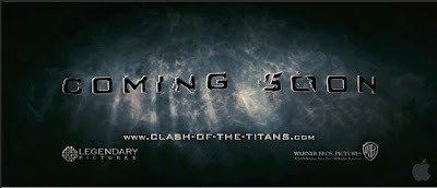
To gain an idea about the layout of this information, we studied some other teaser trailers, paying attention to the final frames and found many of them followed this format. The trailer for Clash of The Titans (Louis Leterrier, 2010) is what influenced our design the most.

To find out if our trailer serves its purpose in making the target audience want to see the movie, I will show it to the relevant target audience and ask their opinion as well as a post-production questionnaire.


0 comments:
Post a Comment